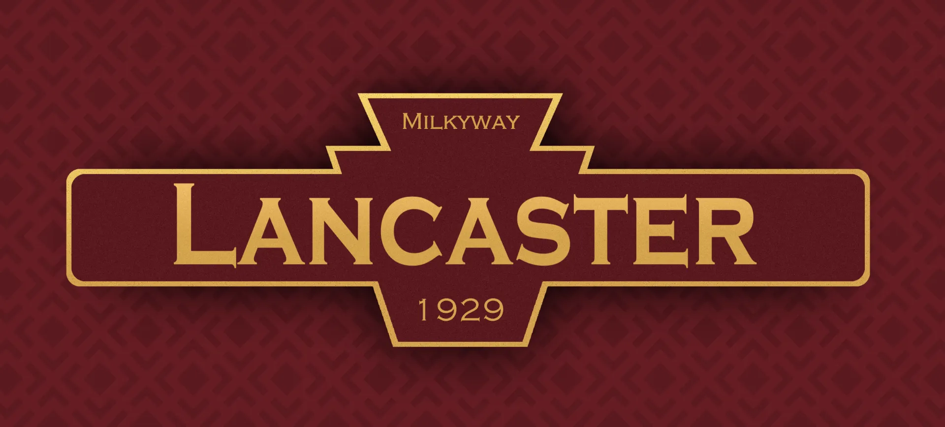
Lancaster was a keycap set that I started in 2020. After the resounding success of Rainy Day, I had a lot of confidence that I could create a set that deviated from the status-quo of cool, blue, black, and gray sets that dominated the market at the time. I wanted something warm and vintage and I already had the inspiration picked out well in advance.
In my late teens and early twenties, I developed a fondness for traveling. My friends and I would frequent various conventions around the country - Otakon, MAGfest, and competitive Pokemon TCG tournaments. I developed a midwestern-esque love-affiar with driving and traveling between my home states - Colorado and Pennsylvania.
In 2017 or so, on one ocassion, I dropped off a friend in Lancaster PA for a train ride and, for whatever reason, that day really stuck with me.
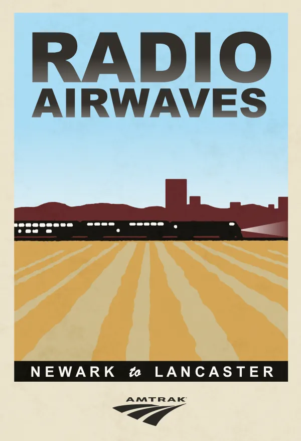
Lancaster Station
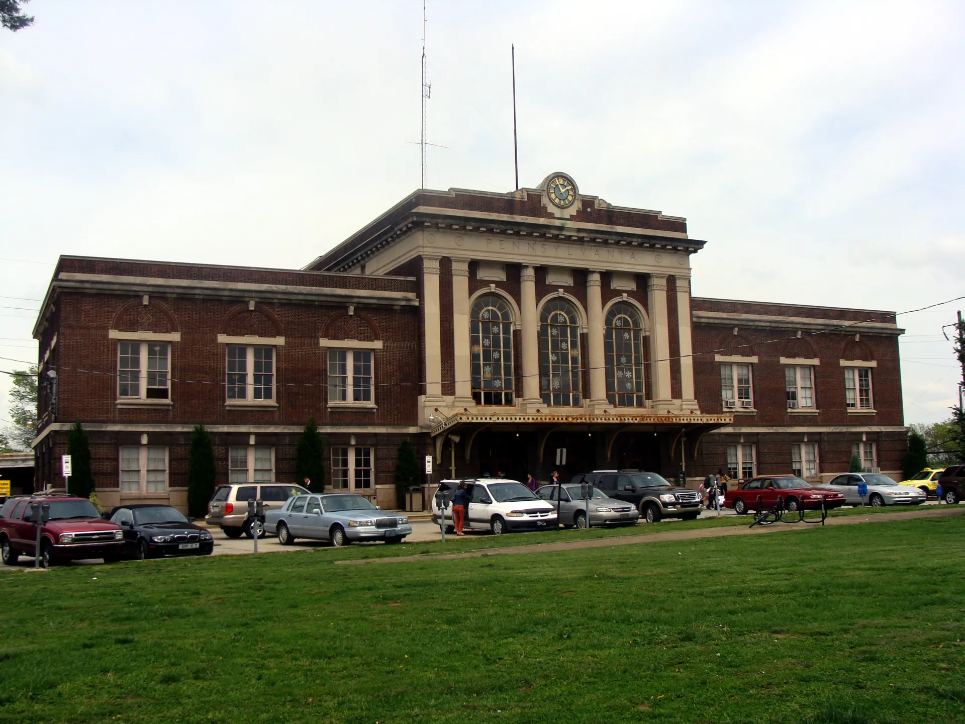
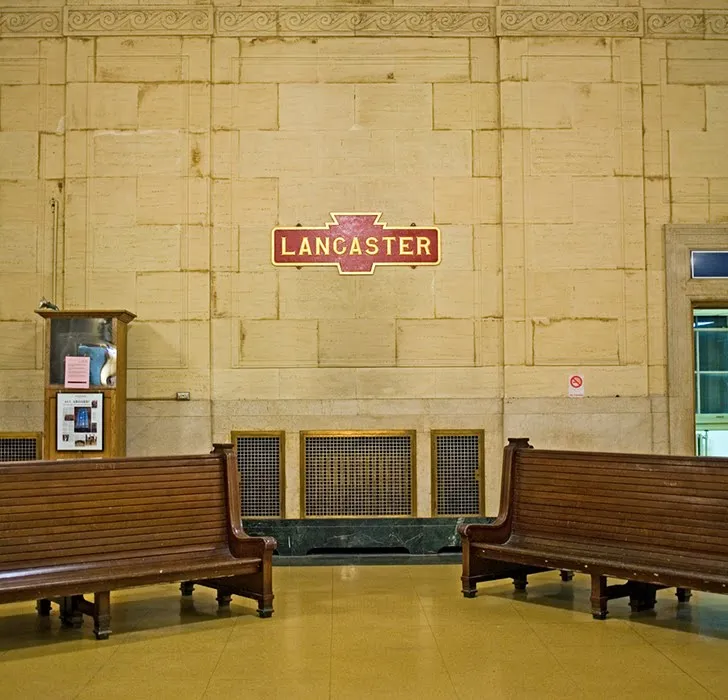
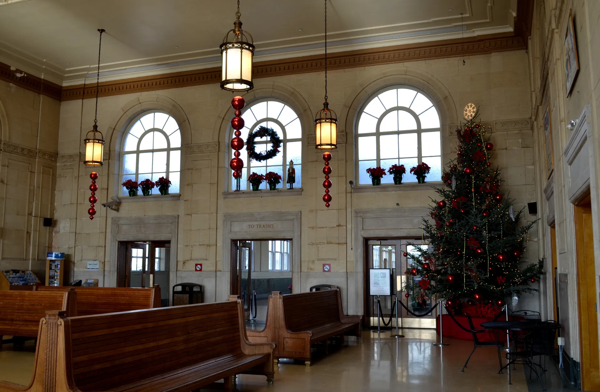
The station was properly and carefully preserved with it's original 1920's charm, making it feel like a portal to the past. The walls were a lovely sandstone beige with accents of red and gold for the plaquards and signs. Immediately the tan stone stood out as a strong candidate for the primary color of the set (the color of the alphas).
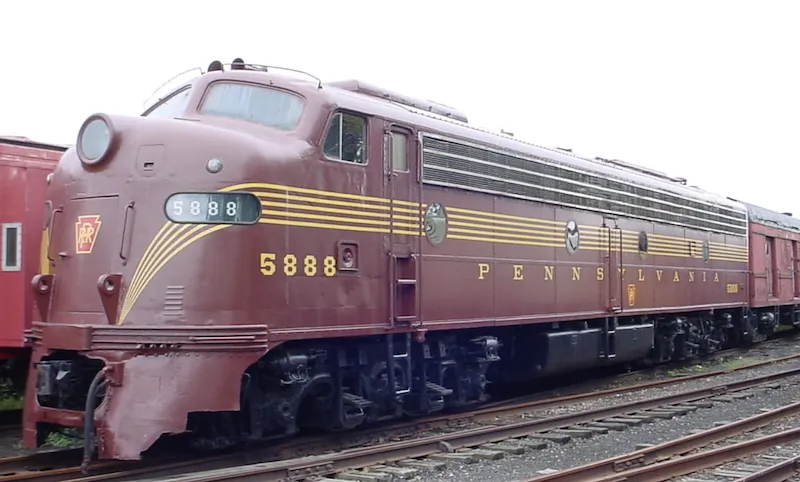
Pennsylvania Railroad EMD E8
The passenger locomotives were painted in a wonderful tuscan red with gold accents that made them look both nostalgic and classy. The pictures don't do them justice. You really have to see them in person. I knew I wanted this to play a core part in the keycap set. For the sake of appeal and coordination, I knew it wouldn't cut it as the primary or secondary color (alphas or modifier keys). It was simply too bold and would only have looked good on a very select few keyboards. The perfect place for this color was as the accent. And in many ways, this made it true to the experience, as the trains were still dwarfed by the warm sandstone used in the building.
Solving the three-color problem
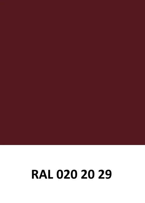
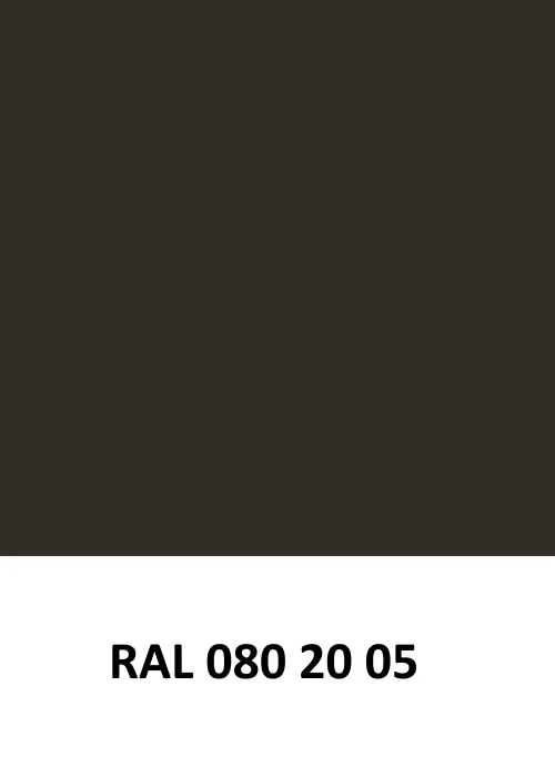
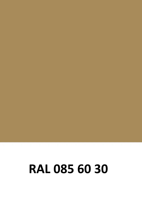
The first pass, in the spring of 2020, was three RAL swatches: a dark red, a near-black umber, and a warm tan. I worked in RAL from the start because the set was meant to run with GMK, and RAL codes are what GMK matches its plastic to. The issue that I ran into though is that it just did not look good. It is a very popular convention to use three colors in a typical keycap set. The alphas and modifiers usually have enough contrast so that you just invert them. The problem though is that I could not find a medium between the sandstone and the gold that properly communicated the feeling of each. Attempting to find a middle-ground to satisfy a three-color palette just made it look dull.
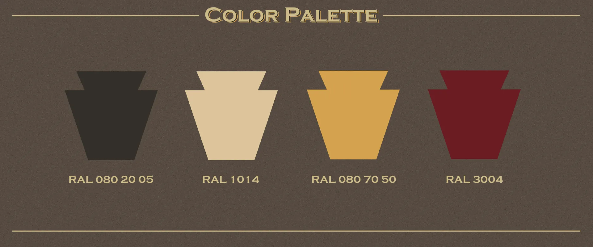
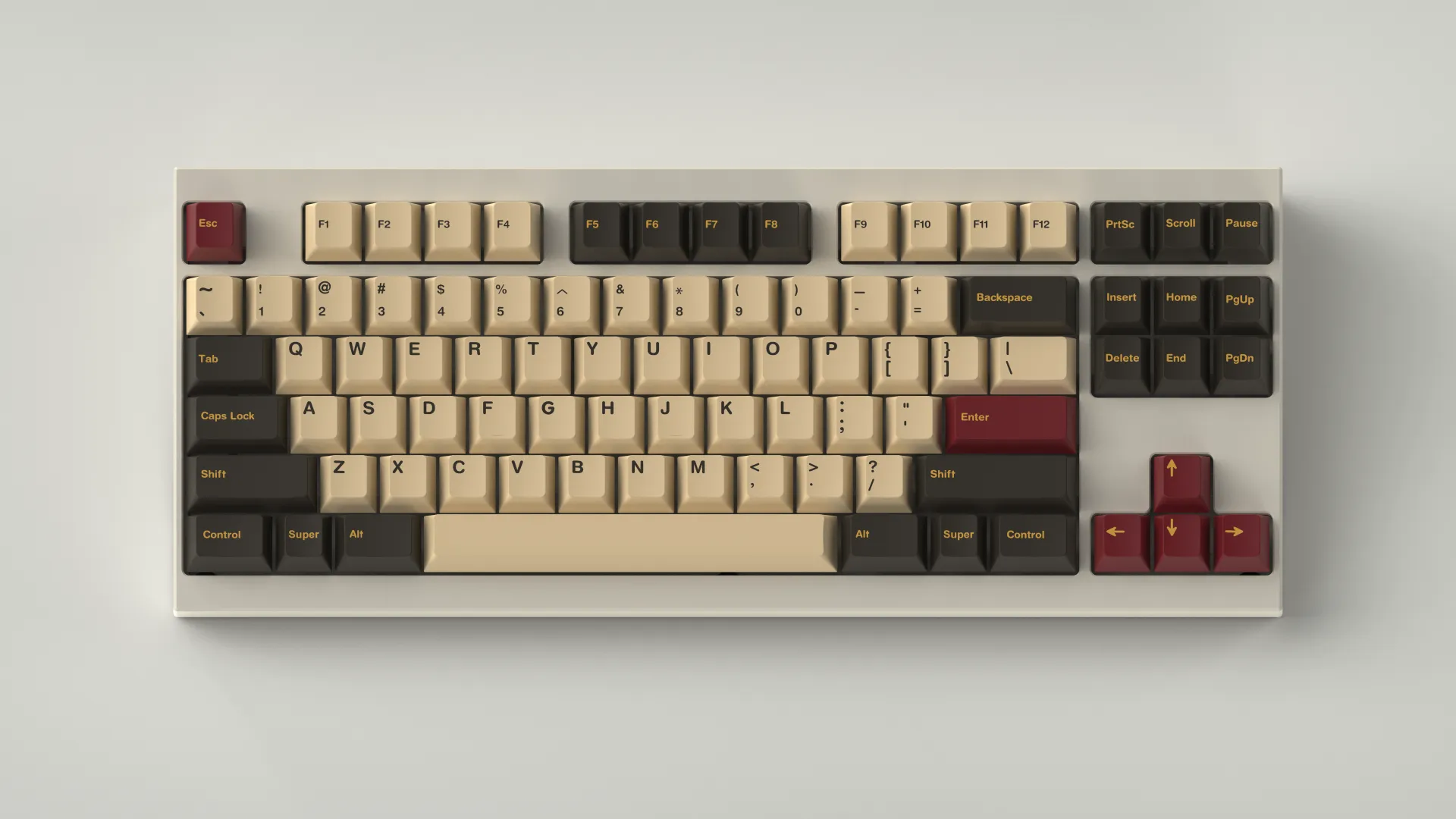
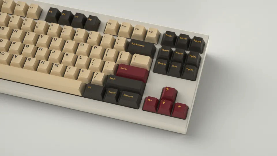
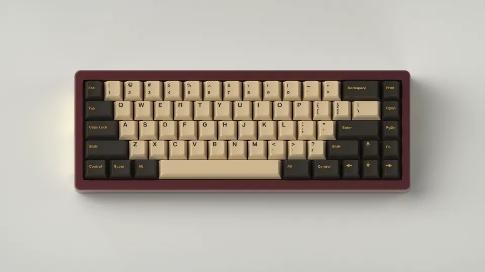
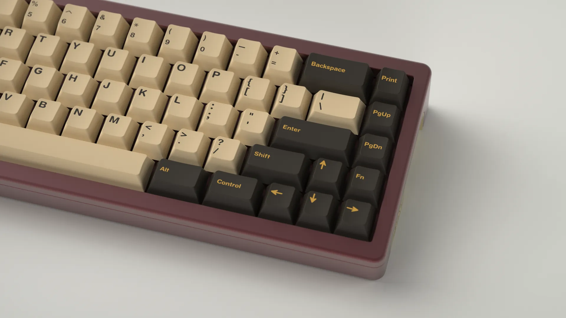
So, I decided to use four colors instead. I split the tan into two colors. A cream which was a bit lighter than the actual tan of the building. And a gold. The result was exactly what I wanted. The gold lit up the modifiers and added a lovely classy feel while the creamy tan retained the feel of the station and providing plenty of contrast.
Kitting & Renders
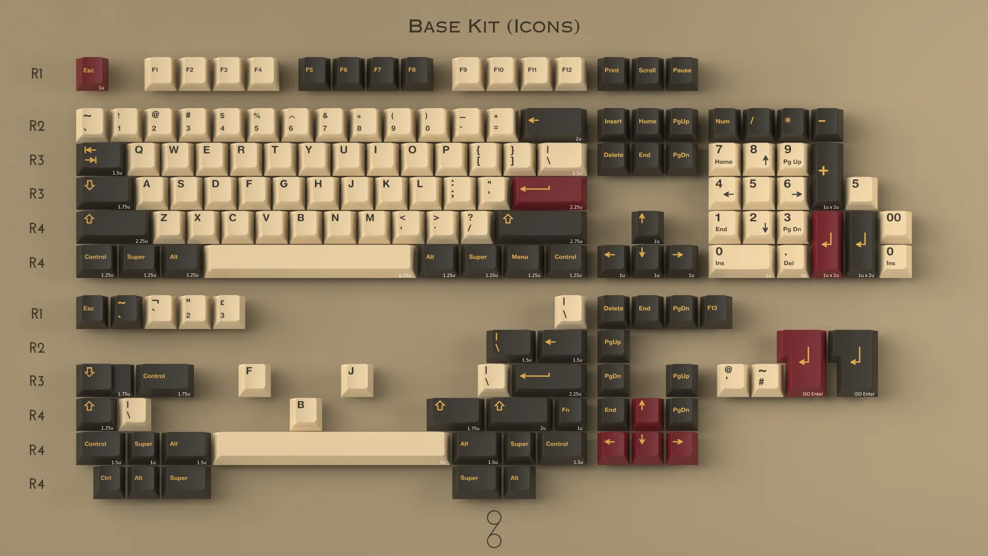
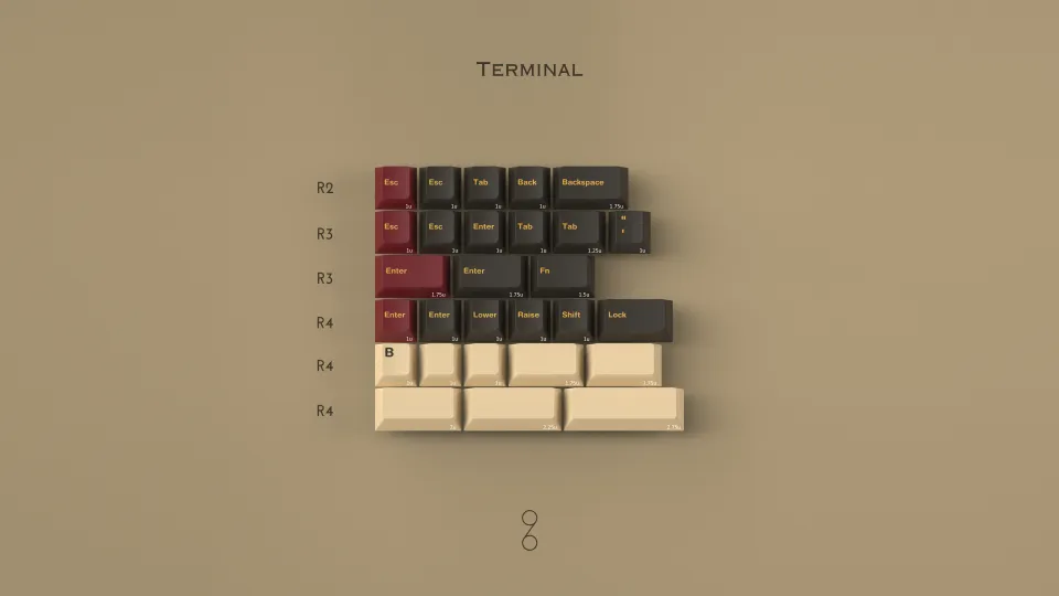
Before colors are settled, many renders are created to judge how they may look in real life. I was extremely happy with where they landed and then spent the next months building out the kits and making the final product renders for marketing.
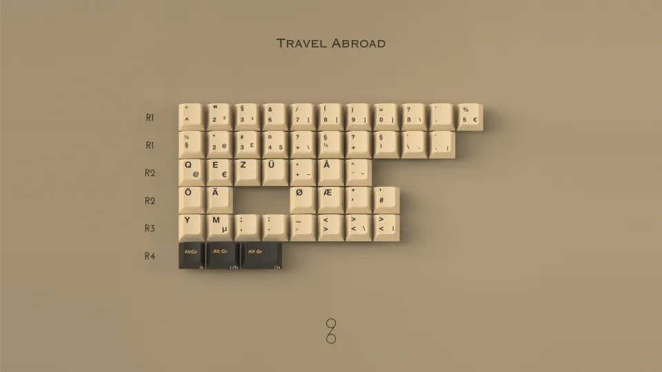
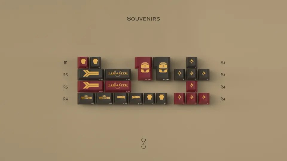
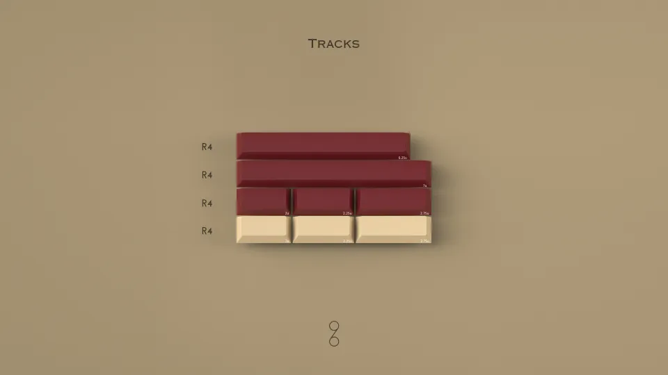
Supporting Assets
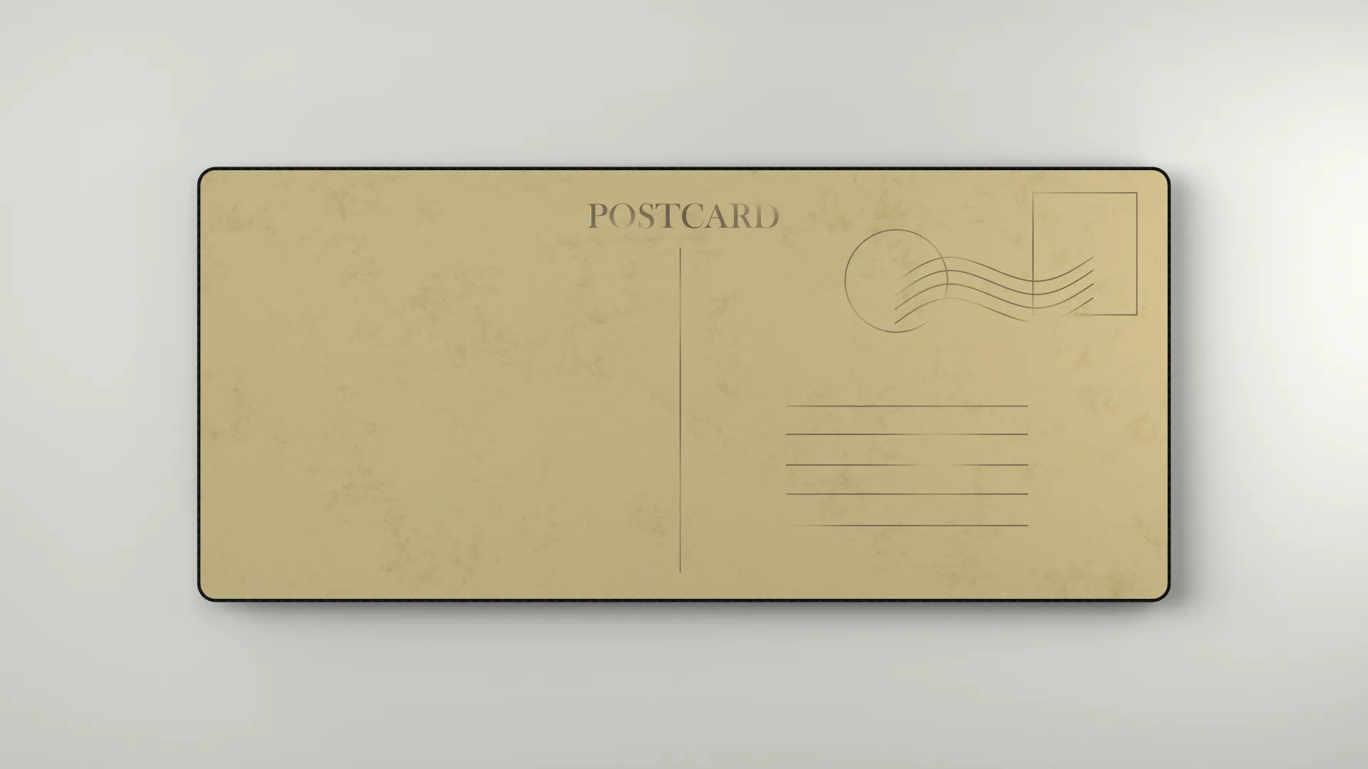
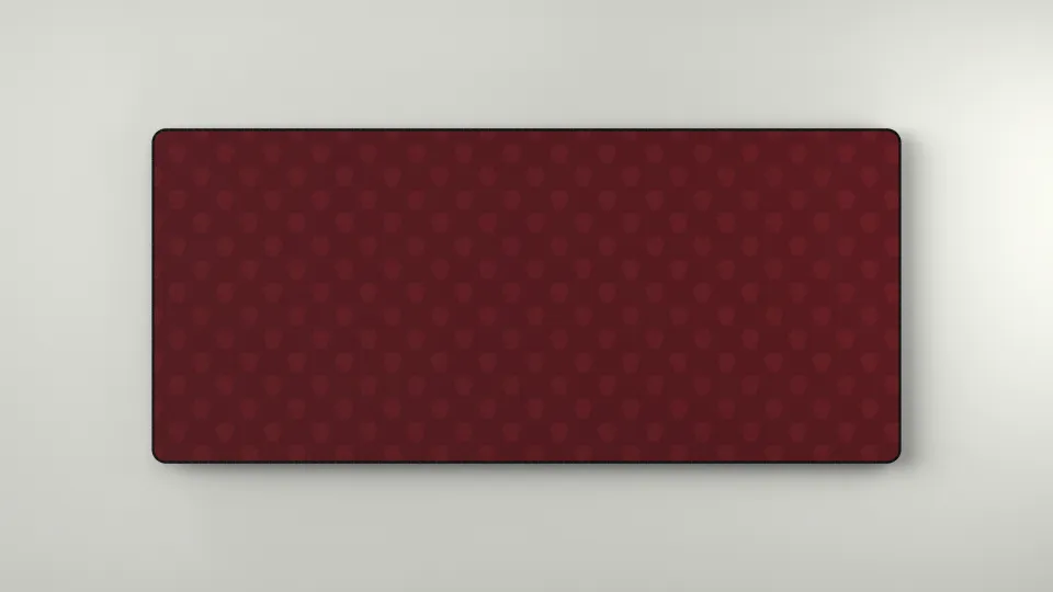
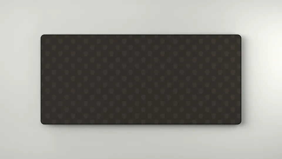
These were the deskmats that I designed.
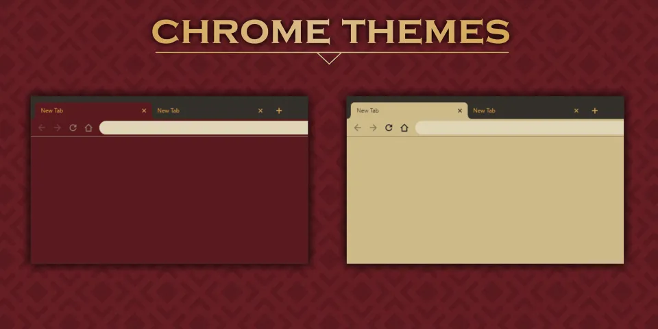
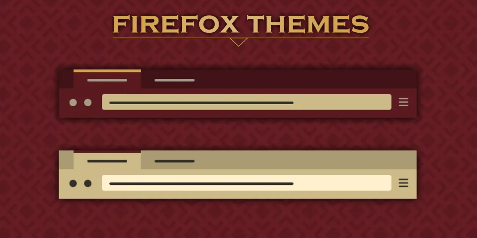
I also made browsers themes in the Lancaster palette.
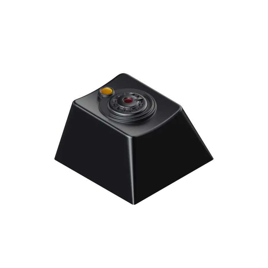
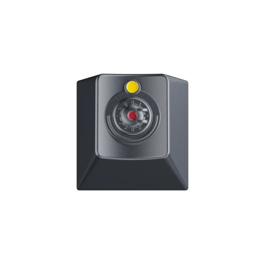
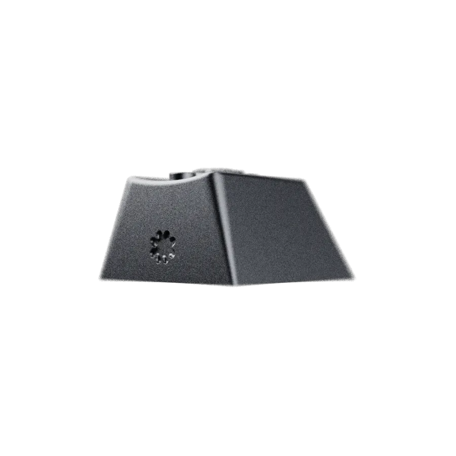
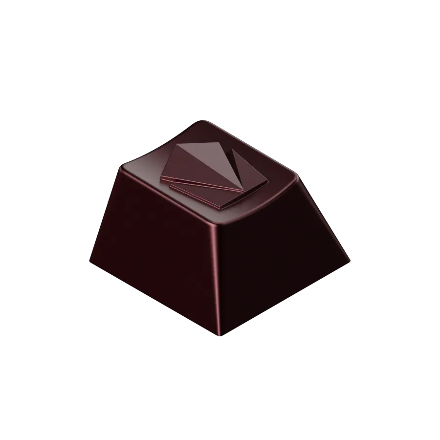
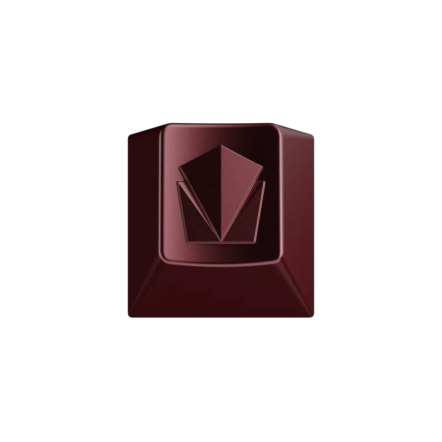
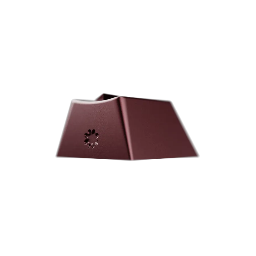
And these were the artisan keycaps that Kate from Hibi helped design.
Change in manufacturer and hiatus
In 2021, a critical decision had to be made. COVID had just hit and the keyboard community was more active than ever. GMK had a 3-year long queue for Group Buys. I could have still ran the set with them, but it would have been a multi-year wait for my customers - if they could have delivered at all given the global shutdowns that were happening. I started doing research and found another factory that had recently joined the space and had delivered a couple of successful sets. I really wanted to deliver this set and it was basically going to be a no-go if I ran it with GMK. No one would have bought it because of the wait times and uncertainty. I took a chance on Milky Way and moved the Interest Check along. The feedback I got from the community was extremely positive and supportive of this decision.
Well, Milky Way eventually dissolved. Communication between the main contact gradually became more quiet and then finally they let me know that they were not taking any more sets and intended to shutdown after fulfilling their current obligations.
Renders by KingK22. Artisans by Kate at hibi. Novelties refined with SpikedSynapse. Cables with SwiftCables. The photographs of Lancaster station and the Pennsylvania Railroad E8 are reference images from the project's mood board and belong to their photographers.